FITC 2017 Toronto Recap
FITC is Canada’s largest tech conference and is conveniently held in Toronto at the Hilton every spring. I’ve been going for the past four years, and I always feel like it’s time well spent. There’s usually a decent blend of practical knowledge that I can take back to my day job, but also also a focus on new media artists that are creating projects outside of the usual business realm. It feels a little like spring cleaning of all the dusty code that’s cluttered my head over the winter; it allows me to reconnect with what’s possible outside of my usual day-to-day experiences in coding.
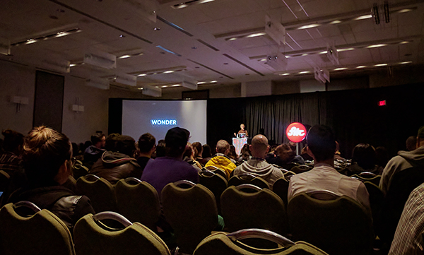
Pictured: Emilie Baltz talking about exploring the senses with tech in her talk titled 'Sensploration'
Every year, an artist or experiential design agency comes up with a theme for the conference. This year the theme was “step into the light”, based on the featured art installation by Red Paper Heart.
Moving Stained Glass from Red Paper Heart on Vimeo.
Spanning three days, FITC has a variety of talks in various specialities. I chose some front-end development talks along with some talks about wearable media and tech-based art installations. Here were some of the highlights:
Styling Hillary
by Mina Markham
In this talk, Mina Markham discussed what it was like working on Hillary Clinton’s 2016 campaign. She was brought onto the web team and given the task of creating a UI toolkit that could be utilized by various codebases (e.g. main website, donation website, landing pages and so on).
What came out of this task was a framework called Pantsuit, that would serve as an internal Bootstrap. What Mina learned was that creating a UI toolkit served as both a source of instruction and inspiration; the style guide offered individual styled components as well as suggestions for templates that would allow people to quickly set up pre-designed landing pages. She also found that creating proper documentation allowed cross-team usage of the new toolkit to empower developers to find the answers they needed, without Mina being the source of truth. What was extra slick was that she hooked her Pantsuit codebase to Slack notifications so she could automate announcements to her team about new versions of Pantsuit, along with links to the updated documentation and release notes.
Another added piece of information that I found helpful was that she talked about the amount of time it took to develop this; six weeks. Often it’s hard to estimate how long an internal project like this would or should take. Setting the bar for a project such as this could help developers, who are advocating for a UI toolkit at their own places of employment, provide estimates to stakeholders.
Storytelling in the Age of JavaScript
by Sarah Drasner
Sarah Drasner is staff writer at CSS-tricks and is basically an SVG/CSS wizard. In this talk, Sarah talked about creating stories within our applications in order to retain the user’s interest and create delight. She talked a lot about loading animations, and argued that custom loading animations distract the user from the perceived wait time.
Here's an example of her work with SVGs:
See the Pen Vue-controlled Wall-E by Sarah Drasner (@sdras) on CodePen.
New Adventures in Responsive Web Design
by Vitaly Friedman
In Vitaly Friedman’s talk, he covered common issues in responsive design and provided possible solutions. This talk was super useful since he brought up best practices as well as cutting-edge front-end development tools.
Responsive fonts
The first topic was responsive fonts. Vitaly argued that we should be using rems on the body, and ems in children components for scalable fonts. I sometimes use em but since you cannot create a max-size for fonts, it's hard to limit the size of your fonts if the user has a larger screen, assuming you're not using a container with a max-width.
In order to get fonts to scale properly between minimum and maximum breakpoints, Vitaly provided a simple formula to attain this:
font-size: calc(min + (max - min) * (100vw - min) / (max - min));
Where max is your maximum breakpoint, and min is your minimum breakpoint. 100vw means 100% of the viewport width (the viewport being the browser window size).
This formula allows you to create your font size based on the viewport width, but also more importantly allows you to create limits for this growth so that you can stop growing or shrinking your font based on a pixel breakpoint. You can read more about this technique here.
@supports
Using @supports is useful when you'd like to detect feature support without using JavaScript. His example was how to detect :hover states across platforms. Since there's no hover event on mobile devices, we (developers) may want to create custom CSS styles based on what's available on a device or browser. Using this feature detecting tool, we can create custom & alternative user experiences for our users.
Low Battery API
A handy API that Vitaly highlighted was the low battery api. This tool allows you to request information about your user's battery status. This is useful in case you want to display a version of your website to suit the user's battery status (e.g. maybe no autoplayed videos, animations, or other battery draining processes).
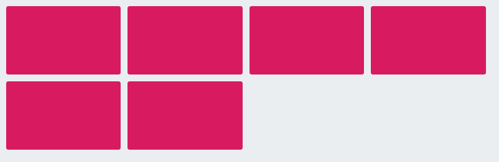
Quantity Selector
Quantity queries allow you to create specific styles based on the amount of items you have in a list or grid-type layout.
So for example, if you have a website with dynamic content, and sometimes there are 5 featured images, and other times there's only one, you can create specific rules in order to handle these styles completely differently. This is REALLY COOL.
For another very basic example, if I want my grid boxes to be pink if there are at-most six on the screen, otherwise they can be blue, the quantity query would look like this:
li:nth-last-child(-n+6):first-child,
li:nth-last-child(-n+6):first-child ~ li {
    background: pink
}
And the styles would render accordingly:
Because these quantity queries are super long and confusing, there are nifty tools that will generate them for you.
In sum, Vitaly demonstrated many cutting-edge tools that can be leveraged by front-end developers today.
Art Installations
I wanted to include one of the presenters who didn't necessarily provide work-related solutions, but rather demonstrated how he's used very simple tech to create displays and robotic installations.
One of my favourites was this hamster-powered hamster drawing machine by Neil Mendoza
Hamster Powered Hamster Drawing Machine from Neil Mendoza on Vimeo.
Thanks to...
A big thanks to FITC for extending one of their diversity initiative tickets to me. As always I enjoyed the atmosphere and talks throughout the three day conference.