Our Cancellation Survey
Like every subscription business, we care a lot about customers leaving. We'd rather they never left! WonderProxy is lucky to still have its first paying customer on boar and plenty of active contracts with auto-increment IDs well under 500. But there's always ways to do better so we implemented a cancellation survey a while back. The survey is super simple: after a user cancels, they're asked why. The data is then shoved into MySQL for monthly statistics.
Design
When I described how the survey should work in our Trello card, I was really picky. Specifically, the following things were really important to me:
- The user should always understand what state their account is in.
- Asking the user why they're cancelling shouldn't make it harder for them to cancel.
- This user should be given the opportunity to tell us how they really feel.
Solution
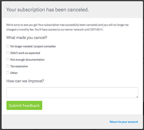
Here's the design we ended up with; the survey appears after a modal window saying "Please wait while we cancel your subscription":

I think we hit my goals quite cleanly:
- The headline "Your subscription has been cancelled" is clearly and accurately describes the state of their account (i.e. cancelled).
- Their account is already cancelled at this point. They can dismiss the window, close the tab, throw their computer into a fire. It's still cancelled. They absolutely do not have to respond to the survey if they don't feel like it.
- There's a nice big text box allowing them to give us feedback.
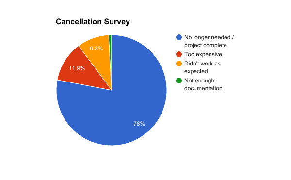
That said, the feedback we're getting is nice but not as immediately actionable as I might like:

Results and Revision
Looking at the data, the low fraction of people complaining about price may actually be an indicator that we should raise our prices, but otherwise isn't that helpful. If 90% of cancellations were price-related, we'd have an obvious area to address. Similarly, the "No Longer Needed" answer is nice (people aren't leaving because they hate us), but it's hard to fix: if their proxy project is over, clearly there's nothing we can do (apart from making cancelling harder, which is a non-starter). We do have a few ideas on how to attack that user base, but it's not low-hanging fruit.
The problem crops up in the comments people leave. Many are great:
- "Happy with your service. We will continue using it when required in the next year."
- "I was very pleased and if I need your service again, will gladly use it."
Others are from customers we realize we've failed:
- "it didnt work - can I get a refund?"
- "It did not work at all"
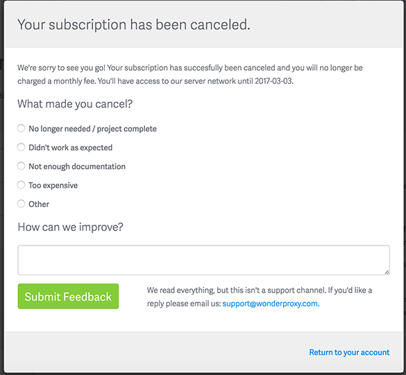
People who wanted help, months ago, whose needs went unmet, and now we've lost them. Given that realization, we decided to tweak the survey form slightly. We considered two approaches: have every cancellation survey with comments hit support@, or ask customers to email support@ if they want a reply.
We ended up going with the latter. I feel like a cancellation survey is the wrong place to start a productive support conversation. The entire page is about cancelling; the word cancel shows up 3 times on that page. Really, the page is kind of a downer. If we instead give them the blank canvas of their mail client from which to start a conversation, I'm hoping we can start off on the right foot. We've managed expectations for response on this form (there won't be one), and put them into the regular support mindset if they'd like to chat.
So here's our new survey:

With this tweak, I feel that we're better managing our customers' expectations when it comes to filling out the form and we'll also continue to receive good data about why they're leaving from departing customers.