A Developer’s Guide to Designing
Recently at WonderProxy, we started developing a new product that leverages our network of proxy servers. Using the technology of the Where’s It Up API, we started to build out a monitoring service called observ.io. The WonderProxy team first decided to buy some domain names, register our official twitter account (v. important) and commissioned a logo for our new service. Behold! observ.io was born.

Fresh new logo
As the front end developer and therefore de facto designer at WonderProxy, it was up to me to take our newly designed logo and begin to prototype the look and feel, as well as the front-end code for our beta product. Meanwhile, Gemma (software engineer extraordinaire) was building the functionality of the API.
As a developer, I know that UI design is notoriously complicated; not only do you need to know basic design principles, but you also need to understand your user while making the UI as simple and intuitive as possible. This is no easy task. While I’ve dabbled in UX design at previous jobs, for the past few years I’ve been mainly focused on the usability and organization of my code rather than user-facing design. I had to ask myself, am I experienced enough to embark on designing a product? Initally when starting this project and having googled things such as:
I stumbled upon a blog post called On Being A Designer And A Developer. The author succinctly describes these roles as being linked:
Both designers and developers put a premium on simplicity and clarity. Both are trying to make their creations as easy to intuit and work with as possible.
Developers refactor their code as requirements change and complexity increases the same way designers redesign interfaces to make room for new or changing functionality.
This point made me realize that design and development aren't too different after all. Working as a developer within a team of specialists, I’ve been exposed to various design processes and methodologies, while being exposed to principles of design patterns and philosophies.
With this new philosophy, past work experience and armed with some minor design theory (heyo Studio Art major), here's how I've been approaching designing observ.io whilst also developing it:
Research Everything
Borrowing from the lean UX methodology, before designing a page or component I would ask myself: how have others? Sometimes you have to remind yourself of the conventions of web design - what links are necessary on a login page? Where should components be placed? What will a user do if they can’t remember their password? I went through a few of my favourite applications and examined their approach at design problems: what worked and what didn’t.
Another valuable source for researching UI components (among other things) is Dribble. Dribble has a lot of features I’m only now discovering, such as being able to bucket favourite designs into various categories which makes for easy rediscovery, and searching designs by hex code.
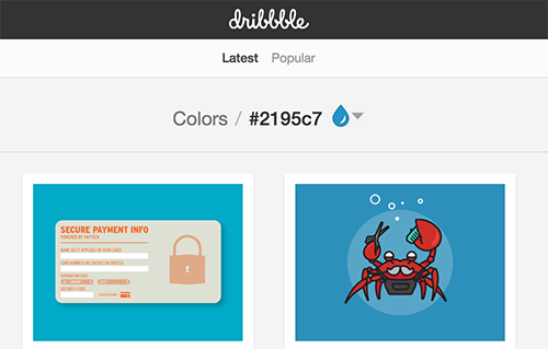
View designs on Dribbble by hex code
I use Dribbble when I'm looking at how others have approached a design decision, and also to validate my own assumptions about design.
Another resource I used to validate web conventions is UI Patterns. UI patterns goes through various components that are conventional on the web, such as tabs or navigation or modals, and discusses their appropriate usage. Most of this information seems like common sense, but sometimes as a designer it’s easy to go off the rails and design something totally weird (which I do all the time).
Resources:
https://dribbble.com/
http://ui-patterns.com/patterns
Ask Questions
When I’m tasked with a new page or component to create, the stakeholders typically include a detailed wireframe so that I have a sense of what’s going on in the app. Since I’m not the target market of our service (at present) I don’t often know the significance of how some of the tests function and how to render their results. It’s helpful to get as much clarification from the stakeholders as possible before beginning the design.
Usually the stakeholder will include a description of the product feature in a ticket (or trello card) and include various wireframe attachments to show basic functionality.
Resources:
https://balsamiq.com/
https://trello.com
Get Feedback
Design is not meant to be done in a vacuum. It's vital to ask for ongoing feedback as things are built. Thankfully all of my coworkers are helpful and have great ideas when I get stuck or don’t know how to go about a specific problem. We use Trello for commenting on in-progress or completed work, which I prefer as a solid record of feedback. We also Slack for direct or group messaging.
Product Design
The look and feel of observ.io BETA is still very much a work in progress. To get something resembling an app up as fast as possible, I had to make some decisions about colour & type and try to not dwell on them too much. For the main body font, I looked for something simple and readable that complimented our logo font, Co Headline. After trying out a few interesting looking fonts I settled on a classic: Proxima Nova. I then generated some complimentary colours based on the logo colours with the super handy tool Coolors, an online palette generator.
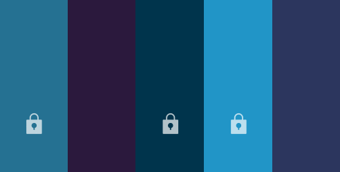
Example of using coolers.co: I've locked the colours I want to keep and am generating new possible complimentary colours
These are just the basic building blocks of what will become part of our styleguide for this product, but a few design touches do a lot to turn a basic page into something uniquely observ.io.
Resources:
https://coolors.co/
Be Flexible
The BETA version of observ.io is in continuous development, so our product - and therefore design - is constantly evolving. With this in mind I don't find myself spending a ton of time researching and developing the best possible design solution for the task at hand, rather figuring something out that's at minimum usable for our user base.
As I continue to shape the look & feel of our observ.io product, I am constantly re-evaluating how features work and the information architecture. It's an advantage, that as a developer, I can try out live functionality on test-branches whenever I feel like a feature warrants a redesign. This works for simple features or basic layout ideas I want to test out, but if I'm trying to design something somewhat complex and I don't want to start writing throwaway CSS, I pop into Sketch, copy an "empty" version of the website (e.g. just the main container, menu and heading) and start testing out design ideas.
Resources:
https://www.sketchapp.com/
Key Learnings
When you're a part of a small agile team, it's both challenging and fun to go beyond your usual comfort zone and into another area of specialization. Challenging myself to do more design than I'm typically comfortable with has been humbling but also presents a learning experience. Perhaps I'm not outputting the most cutting edge designs in the industry, but as a developer this has been a great opportunity for me to start taking the steps towards becoming a better designer.