User Feedback & UI Animations
When you're just getting started in your career as a web developer, you just want to get the code right. Desperately. At some point down the line, when you've learned the JavaScripts, you get the looping-things, and maybe you even remember to do input validation, you'll finally have the energy to focus on user experience and UI animations.
We know from The Design of Everyday Things that design serves as the communication between object and user. When you're developing user interfaces for the web, it's important to remove yourself from the depths of the codebase to consider user interactions and common design patterns.
In my previous roles, I hadn't given UI animations a ton of thought beyond animating :hover & :focus styles. Now that I have have both development and design duties at WonderProxy, I've realized that switching back and forth between mindsets necessitates a deep consideration of how to develop meaningful UI interactions, and I've been focussing on developing that consideration.
In this blog post I'm going to take a look at some UI animations and user feedback mechanisms in WonderNetwork products - past & present - and examine their purpose and effectiveness.
User Feedback
Form Input: Fancy Date Calculation
Here's an example of user feedback on a form inside our Wonderproxy admin panel.
When an admin enters a date into the input box, the date is checked and reiterated below the input box, assuring the user that their date has been entered correctly and providing the day of the week.
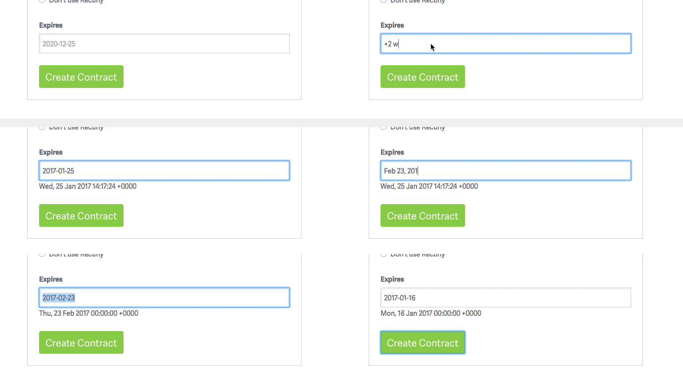
The input has flexibility to allow a few different types of input, which conveniently lets admins say "expire in 2 weeks" without having to look at a calendar/do math/know what day of the week it is.
Form Input: Username Validation
Wonderproxy has somewhat strict username character limitations. When people sign up for WonderProxy, they're met with a simple signup form. For the username field, we provide a placeholder that demonstrates a valid WonderProxy username, acme-company.
When a user types an invalid character while specifying the username, we magically display a notice that describe which characters are actually valid. This is a helpful step to enable users to complete the form without friction, and also avoids 'I submitted the form and apparently my username can't contain an _. I submitted it again and it can't contain a .. I have now pulled out all my hair in a blind rage' issues.
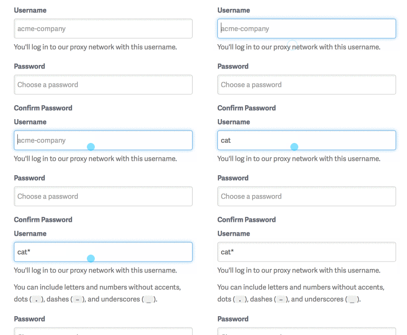
Writing this up, I started thinking about other user interactions that might helpfully lead the user to successfully complete the field. Adding an error class to the field, or highlighting the notice in red may be a next step to further steer users in the right direction.
UI Animations
In addition to form inputs and user feedback, we've been thinking a lot about how to handle loading states. Whether the user is submitting a form or using ajax to poll for data, we want to communicate that the content or data is en route. In general, a loading GIF or cycling CSS3 animation is sufficient to identify the parts of the page that are still loading.
Loading States
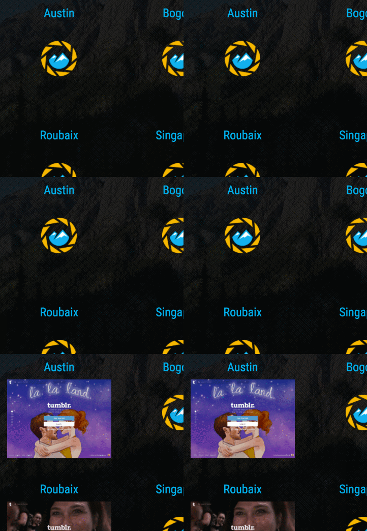
For example, in the Where's It Up demo, we show areas of the table that are loading with a simple cycling gif as pictured below:

For ShotSherpa, we created a custom gif using our logo:
Form Submission
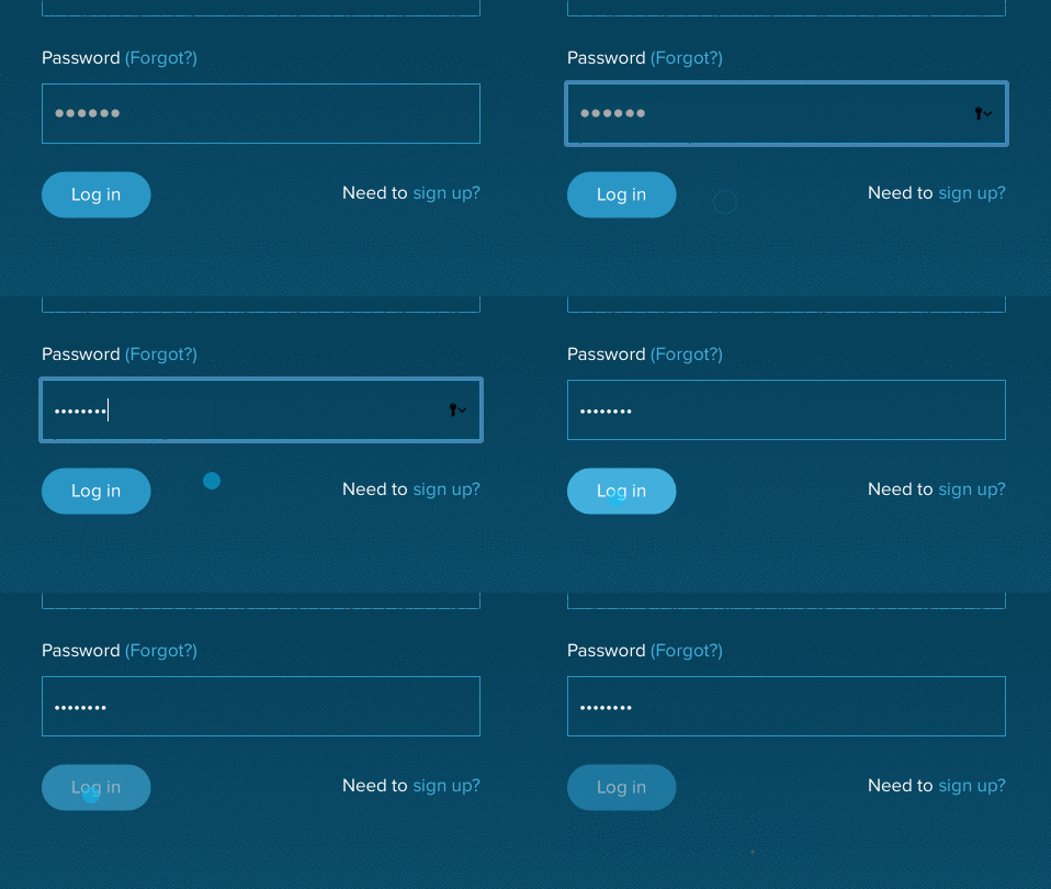
With form submission, we can use various UI elements to indicate that a form is submitting.
Upon submit, we disable the submit button so that the user knows that they successfully clicked the Log in button and that their user data is being authenticated. We also show a ... loading image to denote that things are happening, so that the user is reassured that they should wait for the login request to complete. Of course, should the login request fail, we need to ensure that we enable the button and remove the loading image.
The following screenshot from a super secret forthcoming WonderNetwork product demonstrates UI Animations during login form submission.
Delight & Surprise
Another area of the UI animation world enables you to use that-new-cool-thing-that-CSS-does. Animations for the sake of pizazz and delight are very much coveted these days and can be great when used sparingly! Much like Powerpoint/Keynote transitions, less is often more. Playing with more complex :hover animations can provide an exciting alternative to expected browser behaviour and delight users without distracting.
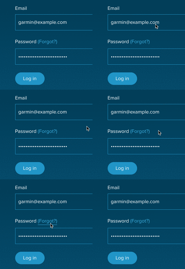
Fancy CSS3 underline animation
Reign It In
With any animation come great responsibility. When you're building a new product where the possibilities are open, it's important to catalogue the animations found within your product so that your animations are consistent across user behaviours (e.g. what happens on button :hover and does it apply to all of the buttons?) as well as consistent with UI patterns of the web as a whole. Innovation is great, but confusion is not.
Since I've been working on design elements within WonderProxy products, I've had to consider how users might interact with and interpret the animations I employ. I'm looking forward to getting feedback from beta users in our upcoming product that we're building with React & Redux - where there will be all kinds of loading & ajax animations that naturally accompany SPA frameworks.