9 Tips on Website Localization Testing
Okay so you've been given a large website that will roll out in, say, 85 countries and countless languages, sometimes more than one per country. Sure, many of these will be in your native language, but no, you won't be able to speak or understand most of the languages. Some of them you won't even be able to read as they're in completely different scripts. It's literally “all Greek to me.” (Factoid: The French say “It's all Hebrew to me.” Even idioms get translated differently!)
The list below is from my experience working with NIVEA and the Dubai Electricity and Water Authority websites specifically.
So how do we go about testing localization and whether that will work as expected? Let's break the pitfalls down into manageable chunks so we can see what risks lurk in specific languages.
- Latin characters without (or with few) accents
- Latin characters with really long words (in effect, German and Polish)
- Latin characters with accents (diacritics) (e.g. French and Romanian, you'll see why later)
- Cyrillic languages
- Greek (let's keep this in its own category, you'll see why later)
- Turkish (let's keep this in its own category, you'll see why later)
- Right to left (RTL) languages: Hebrew, Arabic, Farsi
- Chinese and Japanese
- Thai
Let's go through these nine categories one by one.
1. Languages without accents
From my experience, sites I have worked on have mostly been in English, or designed initially in English with the idea to localize them later. I have worked on others in other languages but they haven’t usually been multi-language sites.
Your site may have a different “base” language, and that’s great. However, from a localization perspective, English is relatively simple as it has (almost) no accents (also known as “diacritics”). Let’s assume that the site is in English and looks and functions as expected. This is our “base” language as it’s the simplest one for testing Latin characters without accents.
Aside from copy proofreading and grammar issues, let's assume this is visually our base to which we will compare everything.
2. Languages with really long words
So German has famously long words. As a rule of thumb, we want to test UI elements such as titles, buttons, links and texts for “double English” so we get a sense of what it MIGHT look like IF we had longer text than in English, in fact, up to twice as long, and to see if the site looks and behaves as expected.
To test this, take every string and (roughly) double the length of it (e.g. from “Read more” to “Read more Read more”). In an extreme case you can use “triple English” (because what tester wouldn't want to see how far you can go before you break it? (e.g. “Read More Read More Read more”).
I also have a tendency to label the text with a “QA ” prefix so that I know that the text isn't hard coded anywhere, and I know what I have and haven't localized yet. For example, “Read more” becomes “QA Read more Read more.” Then publish or preview the page (depending on the CMS you are using) and see what it looks like on screen.
What happens to the text? Does it wrap? Does the text get truncated? Does it go off the bottom of the element? Does it run off the bottom of the page or block or go behind some other element on the page? If it is a button, does the button extend as the text gets longer? If it wraps, does the button (sometimes a lozenge) break?
Here's an example of truncation on the first drop-down option. The button extended but then the text was truncated.
 (credit to nivea.co.uk)
Here's how a button extends gracefully when you double the text:
 (credit to nivea.co.uk)
Here it wrapped gracefully too, if I triple the text to try to force it to break. Maybe they knew I was coming and pre-empted it! Good job.
 (credit to nivea.co.uk)
3. Latin characters with accents
Let's assume you don't have the copy for the other languages. I take the English and put it through Google Translate and paste the result in the CMS or whatever you are using. This gives us an idea of what it might look like with real content in that language.
Testing in French will cover a bunch of countries (aside from France it covers French-speaking parts of Canada, Belgium and Switzerland).
The particular thing you want to look out for is whether accents crash into each other when two or more lines appear and contain both accents above and below. This affects Romanian particularly badly. Since accents can be both above and below characters, if the developers don't consider the presence of accents and don’t leave enough line spacing between rows of text, the accents can, and sometimes do, overlap.
I manipulated the copy below to produce an example. This COULD be an issue with live text IF the right combination of characters overlapped, as the line height isn’t sufficient to prevent it. The fun thing with testing is that you can create edge cases that might occur, and head them off before they happen.
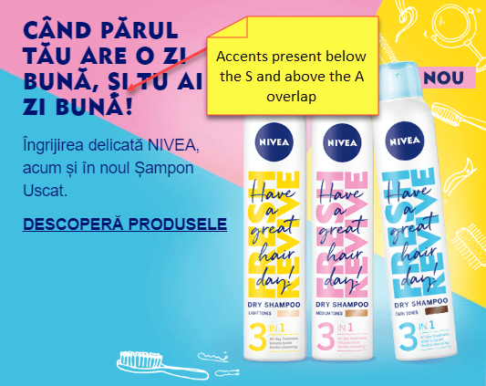 (credit to nivea.ro)
4. Cyrillic
Given that I cannot read Cyrillic, using the Google Translate method of generating some dummy content revealed that if you are using proprietary/custom fonts, some characters may appear thinner/less bold/in a different font to the surrounding text. This would indicate that the font doesn't contain specific characters.
5. Greek
This is an odd one. The copy in the CMS is in lower or sentence case. The CSS makes the text upper-case. In English and other Latin languages, this was fine.
In Greek, so I am told, given that I do not speak Greek, when you upper-case characters from lower-case using CSS, you do NOT get the upper-cased version of the text. You get gibberish.
Think of it this way: If I write “This website is a test” in English, and upper-case it, I get “THIS WEBSITE IS A TEST.” In Greek, you might get the nonsensical equivalent of “THXS WEBSXTE XS H TEST.” That doesn't make sense to a user, as upper-cased characters apparently map to different characters than the ones expected.
The solution in Greek: Enter the text in the case you want it to appear. Even if the English version of the site contains lower/sentence case, if you need the text in upper-case in Greek, enter it in the CMS in upper-case so that the CSS doesn't have to do anything.
6. Turkish
As with point 4, you may find certain characters don't exist in the font you are using.
Watch out especially for dotless lower case i characters (“ı”). Firefox used to have an issue with this, which was not font-specific. Sometimes fonts don’t include the character, even if it isn’t a browser issue.
7. Right to Left (RTL) languages: Hebrew, Arabic and Farsi
Various things to check here.
- Check the markup of the page contains the following:
<HTML dir="rtl" ...>
I once worked on a site where the text was right-aligned (as expected) but the text was written left to right. Aligning the text to the right is not enough. That's the equivalent of writing English as follows: “etisbew a si sihT.” It won't make sense to people in the target country.
- Hebrew has characters that are not joined together. They are distinct individual characters, and right aligned. Question marks appear at the end of the sentences, so on the left, and are not switched round, i.e. they look like a question mark in English.
 (credit to nivea.co.il)
- Arabic and Farsi have characters that are (mostly) joined together (called “ligatures”). Ensure that the letters in each word generally touch the next character (reading from right to left). Some fonts won't do this, so you should question it, and assume it's not correct if NO characters touch the neighbouring ones.
e.g.
 (credit to dewa.gov.ae)
One more thing to note with RTL languages:
- Moving the position of the text so it doesn't obscure the subject in an image: In English, say an image has text on the left and a person on the right. If you right align text in an RTL language, that text will sit on top of the subject in the picture.
In the example below, the text is written right to left but left aligned, so that the subject of the picture is not obscured, i.e. the text position has been manipulated for the RTL language and appears where the English would appear, but still makes sense because it reads right to left while retaining the original image for consistency. Without this, I found that the text sat on that lady’s face, and that prompted me to look out for this issue for other RTL languages.
 (credit to nivea.co.il)
8. Chinese and Japanese
When I worked on NIVEA, we had a custom font file that was 20Mb, and we didn't want to send that to each user for each time they viewed the site as it would significantly slow down the user experience and consume bandwidth when 3G was the best technology available at the time.
Various options are available since the one we implemented back in 2011 where we sent the copy to a PHP server, rendered an image and served the image instead of the text (with ALT text for the copy too in case it all went a bit wrong and no image was returned).
Suffice to say, the issue in tip 4 above will still apply, i.e. check that all expected characters render in the same font.
Another issue noted is that since Chinese and Japanese do not have spaces between words, the text can wrap in the middle of a word, and the client may take issue with that. If needed, add into the copy to force a line break in specific places. This, however, works better in some browsers than others, since different browsers render characters with slightly different widths and heights, so you can get some extra unwanted spaces where the next characters would fit in one browser but not in another. It is always a compromise. Go for the most common browser like Chrome and see how it looks in that.
Also see tip 9 below.
NOTE: Korean has relatively simple characters and a small alphabet, so does not suffer from the issue.
9. Thai
Thai has a small and intricate character set. Therefore, to make it readable, you may need the font size to be increased specifically for Thai.
When we inserted English text in the middle of the string of Thai text (e.g. “NIVEA Sun”), we found that the font did not contain Latin characters, so the Latin characters came out in a system font. This was a shortcoming of the Thai font we were trying to use so we had to choose a different font. There may be more elegant solutions but we didn’t have any at the time.
This issue may also appear in Chinese and Japanese fonts if Latin characters are not supported within the font.
There you have the sum of my experience. Go forth and break stuff!