The bug that finally convinced me I’d never be able to find all the bugs
I used to think that if only we had more time for testing, we’d eventually find “all the bugs”! But I started noticing that most escaped bugs I could remember were things I never would have found, or couldn’t have prevented anyway. This was the one that finally convinced me that finding “all” the bugs was truly never going to happen.
A time where I actually got to do all the testing I could think of
When I worked at D2L, my team was building a report to help school administrators understand which tools within our learning platform were being used most often by their students and teachers. Each time a user visited a tool, an event was recorded that indicated which tool was visited. The report we made is a visual representation of the aggregated event data. The normal layout was a few larger sections and some smaller ones.

Figure 1: This is what we generally expected the Tool Usage report to look like.
We did a LOT of testing for that report.
We tested the graph's appearance. Some of the questions we asked ourselves, and answered via testing efforts, included:
- What if there are a really large or really small number of tools available?
- What if tool names contain special characters or appear in other languages?
- Can the graph be understood by someone using a screen reader?
- Does the graph look good on phones and tablets?
- Does the graph appear as expected in all the browsers we are supposed to support?
- What if there are really long or short tool names?
We tested the end-to-end event data flow. We spent even more time answering questions through testing in this area:
- How long does it take from the time an event is sent to the time it is reflected in the report?
- Are all of the appropriate events fired even when the system is under heavy load?
- What if the same user visits the same tool many times in quick succession?
- Is an event fired if a tool is accessed via the API rather than through the UI?
- Will events be re-queued if the event processing system is down or unresponsive?
- What kind of event is sent when using the learning platform’s impersonation functionality?
- What happens if an event is malformed in some way?
We tested data retrieval robustness. We felt we did a good job covering a wide range of possible scenarios. We asked things like:
- What is displayed if no data is available, or data cannot be retrieved?
- What happens if the retrieved data arrives in an unexpected format?
- Is the retrieval of the data appropriately restricted to users who have permissions to view this report?
- Does data retrieval time increase for very large data sets?
- Does data retrieval time increase when a large number of users access it simultaneously?
- How is the graph affected when a user retrieves data from a different time zone?
After covering all of the areas just described, plus many more, we felt pretty good about the reliability, accuracy, and usability of this report. You might even say we went a little overboard on testing for a relatively simple pie chart! Although we felt like we had really nailed our test coverage, we were soon to find out that our confidence was not quite justified.
The important thing that we didn’t know existed
However, almost immediately after we released the report to our customers, we began receiving support tickets indicating that the information in the report appeared incorrect. They sent us screenshots of what the reports looked like on their end, and we were forced to admit that there did seem to be a problem.
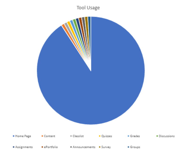
Figure 2: This is what the Tool Usage report actually looked like shortly after its initial release to production.
Almost the entire pie chart was taken up by one giant slice representing the Home Page Config tool. It seemed highly unlikely that this one tool was being accessed orders of magnitude more frequently than all other tools, and that this could be the case across multiple clients.
But how could this be? Based on our extensive testing, we were very confident in the event flow, data retrieval, and display functionality of our report. This was one of those rare situations where I felt we’d actually had sufficient time and resources to finish testing pretty much everything we could think of.
As we began to dig into the issue, we learned something very surprising. It turns out that each instance of our learning platform has a special "monitoring" user configured. As part of a series of ongoing automated site stability tests run by D2L’s network operations team, this user visits the Home Pages Config tool once every minute. No wonder that slice in the pie chart was so disproportionately large compared to all the others! Feeling pretty embarrassed that we had never heard of monitoring users, we fixed the issue by having the report exclude data from this type of user.
A change in perspective: You don’t know what you don’t know
Once the update was successfully shipped to production, I started reflecting on how we could have missed such a significant issue, despite being so careful in our test planning. “Monitoring” users didn't exist in any of our test environments, and until that point, I had no idea they existed in production either. Therefore, I had no chance of ever connecting the dots that automated production monitoring activity could show up in our report, and hinder its accuracy and usefulness. Even if I had known about the concept of “monitoring” users, I'm still not entirely sure I would have made that connection or thought to test for it.
No matter how well we know the system or how good we are at test planning, there will always be unknown unknowns. And we certainly won't be testing for things we're unaware of, no matter how much time we have.
Ever since this bug, the one that finally convinced me I’d never be able to find all the bugs, I’ve been less interested in striving for testing perfection (or even excellence) prior to shipping code. Instead, I try to invest at least as much time and effort in being prepared to handle unexpected failures.
How to be ready for failure
What does readiness for failure handling look like? Some of the things I prioritize include ensuring that monitoring and alerts are considered as part of any new feature, and that monitoring and alerts are also themselves tested, just like any other part of the system. As much as possible, I strive to release small, incremental changes so that problems can be more easily identified and addressed. Where feasible, it’s also helpful if changes can roll out gradually - perhaps to some customers or regions at first - and then expand the rollout based on evidence of initial success.
To help my team when things inevitably go wrong, I encourage them to write playbooks and disaster-recovery procedures (and to test them regularly) to ensure we can act decisively under pressure. It’s also helpful if high-quality logging details are easy to find and straightforward to interpret, so that issues can be properly diagnosed.
And of course, once a problem has been identified, it should be easy to fix and ship. Test environments and test data should be readily available, the deployment process should be quick and painless, and any required reviews or approvals should not be a bottleneck.
Quality is resilience, not perfection
Ultimately, in my mind, success is now measured by how quickly and accurately we can detect and resolve problems, rather than by hoping that extremely detailed testing will mean unexpected issues never occur.
Today, instead of striving to test everything I can think of and find all the bugs before we ship, I reserve a portion of my team’s time to invest in monitoring, alerting, and recovery procedures. We always assume that there are important failure modes we haven’t thought of, and we’re ready to handle them when they inevitably do crop up.
The pie chart bug didn’t just teach me a valuable lesson. It changed my whole perspective on the meaning of software quality.